Journal week 3

Image result for powerade campaigns

The ad effectively uses contrast with colors. The ad is mostly filled with warm colors so that the Powerade logo and the blue Powerade drink stands out as a cool color. The ad uses a simile concept to spark interest and to convey, the benefits of drinking Powerade is like feeling like giant in the midst of competition. The giant man located in the middle of the ad is the focal surround by a Blue sky so that the view can immediately focus on the action of the drink thus, aiding the ad with him drinking a Blue Powerade.

anomio. (2013, January 28). Adworlds. Powerade Giant.  https://adsoftheworld.com/media/print/powerade_giant

Image result for dasani advertising

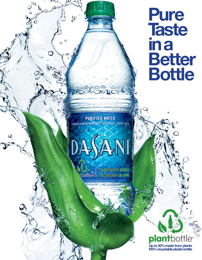
The ad does a good job with color contrast. The ad uses a neutral white background with cool temperature colors such as, green and blue to stand out for the viewer. The ad uses a simile depicting that drinking out of a Dasani bottle is like, drinking out of a leaf. The color green within the word “plant” is to signify eco-friendly material. The Sans Serif font is used to give the ad a more modern appeal.

(2017). TIA. Dasani Case Study. https://lambesis.com/case-study/dasani/


47690 Dasani Aisle Header 20x30

The ad uses a simile approach in which the grass, the lady bug, and bird is inserted in the ad to highlight that the bottle is plant-based. The text, “less plastic” has a neutral white color font which stands out being surround by mostly cool temperature colors. The “more plant” font is used in the color green to symbolize being plant based. The font uses a Sans Serif font to give the ad a modern look due to the use of technology utilizing less plastic. The text, “less” is larger than other text used in the add to highlight more significance.

(2017). SXM Talks. https://www.sxm-talks.com/home-sxm/


Image result for odwalla advertisements

The bottle located in the center of ad is colored in a Red warm temperature color in the midst of cold temperature colors such as, Green and Blue to catch the viewer’s attention. The bottle is held and surrounded by plants to highlight the product being eco-friendly which attracts a specific target market. The ad uses good color contrast using a white neutral color in the text, “Mama Nature’s new little bottle” to make it easier to read for the viewer with a cool temperature background. The text, “Mama Nature’s new little bottle” has decent leading to cause the text to be legible for the reader.

Cernansky, Rachel. (2011, April 5). Tree Hugger. Odwalla”Plastic” PlantBottle Now Made with 100% Plant Materials. https://www.treehugger.com/corporate-responsibility/odwalla-plastic-plantbottle-now-made-with-100-plant-materials.html

Image result for minute maid advertising

The orange color background is used to reinforce the color of orange juice. The ad uses good color contrast in which, the warm temperature of the background causes the viewer to focus on the man in the middle who has more neutral colors. The ad uses a cause and effect approach meaning, if your family drinks Minute Maid Orange juice in the morning, you would potentially receive affection from your significant other in return. The text, “wake up your mmojo” is used in a neutral color to stand out and makes the text more legible. The text, “wake up your mmojo” is also used in large font compared to the other text to highlight more significance.

(2011, April). Coloribis. KISSES by Donor for Minute Maid. https://www.coloribus.com/adsarchive/prints/minute-maid-kisses-16654155/’


Journal week 2


Image result for diet coke typography

The tracking of the text, “Styles evolve but good taste never changes” are good providing enough spacing making the ad legible. The use of Sans Serif font in the text, “Styles evolve but good taste never change” causes the ad to be simple, easy to read, and sensible. Coca-Cola’s goal is to have the customer engage in a good experience which includes enjoying the taste of the product. The add does a good job of displaying the importance of the Diet Coke brand by using good contrast having the words, “Diet Coke”, in a different font style and size.

McBride, Sean. (2017). Twitter. https://twitter.com/smcbride


Image result for powerade text based ads

Powerade is Coca-Cola product targeting those who seek nutrition participating in sports. The text within this Powerade ad has great kerning which makes this ad very legible. The text has great leading which makes the ad easier to read. The bold font style in the text, “Power”, gives the ad and brand a dominate mood which correlates to winning and being successful in sports.

Martel, Stockland. (2017). Martin Sigal shoots Powerade’s dynamic “Power of Love” campaign. https://stocklandmartelblog.com/2015/04/24/martin-sigal-powerade-power-of-love/


Image result for coke billboard

Coca-Cola uses this ad conveying that Coca-Cola products provides happiness during the summer. The Sans Serif font style used provides a simple and sensible mood for the ad. The add has great kerning which makes it easier to read for viewer passing by the billboard. The White color of the text with a Blue back ground provides a great contrast for the ad. The ad does a good job not over emphasizing the words, “open” and “summer”. The ad only uses capitalization as a way of emphasizing words which gives the ad a clean look making it easy to read.

(2013 May, 6). Coca Cola Open for the Summer. Wieden Kennedy. http://www.wk.com/campaign/open_summer/from/cocacola


Image result for diet coke typography

This ad has good kerning which makes it easier for the viewer to read. The bold Sans Serif font used in the “Do More” text displays a strong and straight forward command to the viewer. The Grey back ground gives the ad great contrast in regards to being able to properly read the message on the add.

Karalekas,Nicole. (2017). Nicole Karalekas Art Director. https://www.nicolekaralekas.com/


Click for a positive affirmation to make your day a bit more bubbly. | Diet Coke

Coca-Cola’s target market are those who search for a pleasurable experience consuming their product. The font style used aids in presenting a friendly and happy mood. The ad has good leading which makes the ad easier to read. The ad has great contrast which makes the ad quicker to scan.

(2017). Diet Coke. https://www.dietcoke.com/

Inspiration Journal 1

Image result for coca cola advertisement

The advertisement has a great contrast in which red which symbolizes Coke’s logo color is highlighted with the white background. The left alignment is used to first tell the view to share a Coke and ending on the right with family and friends towards the right. The two main Coke bottles with “Friends” and “Family” have a close proximity for the reason in which Coke encourages to share with both family and friends.

Ryan, Ted. (2017) Coca Cola Slogans Throughout the Year. Coca-Cola. http://www.etinside.com/?p=1433


Image result for coca cola advertisement

The ad has great color contrast in which the black and red colors stand out of the greenish background. The contrast is used to highlight ad’s message and the Coca-Cola logo. The ad puts emphasis on the lady drinking the beverage encouraging viewers consume the beverage. The ad uses a left alignment as the text is positioned on the left for the viewer to naturally read first.

Feloni, Richard.(2015, 12 June). 7 Brilliant Strategies Coca-Cola Used to Become One of the World’s Most Recognizable Brands. Business Insider. http://www.businessinsider.com/strategies-coca-cola-used-to-become-a-famous-brand-2015-6


The ad puts emphasis on the Coca-Cola bottle as the bottle is placed near the center of the add. The add uses great color contrast as the brown Coca-Cola bottle is a darker color compared to the lighter surrounding colors. Although the bottle is near the center, the Coca Cola bottle is aligned slightly towards left for the viewer to begin seeing the bottle first.


Nudd, Tim. (2017, 19 January). Here Are 25 Sweet, Simple Ads From Coca Cola’s Big New ‘Taste the Feeling’ Campaign. Adweek. http://www.adweek.com/creativity/here-are-25-sweet-simple-ads-coca-colas-big-new-taste-feeling-campaign-169075/

Image result for coca cola advertisement

The ad uses a left alignment to immediately show the view the brand’s logo. The ad puts emphasis on the “Coke” letters as the font is a larger size compared to the other wording. The ad uses great contrast as white background is put in place to have the red log and message stand out.

Ryan, Ted. (2017). Coca Cola Slogans Throughout the Year. Coca-Cola. http://www.coca-cola.co.uk/stories/whats-your-favourite-coca-cola-slogan

Coke is It

The ad puts emphasis on the text as the font is large in size and is placed in the center of the ad. The ad uses great movement as the red color of the bottle stands out starting on the left followed by other remaining colors. The ad uses great contrast as the color red is bright and is placed with a background of lighter and darker colors. The red stands out as a bold color representing the Coca-Cola  brand.

(2017, 20 August). ET Insides Advertisements Features Coca Cola. ET Inside. https://www.google.com/search?biw=1242&bih=602&tbm=isch&sa=1&q=coca+cola+advertisement&oq=coca+cola&gs_l=psy-ab.1.0.0i67k1l4.45030.48507.0.50574.9.9.0.0.0.0.165.1156.0j9.9.0….0…1.1.64.psy-ab..0.9.1147…0.pySTL7HMTCc#imgrc=9hDISC69DuwfCM: